Area Charts
Use area charts to look at the bigger picture
Take population for example: Line charts are good for showing net change in population over time, while area charts are good for showing the total population over time.
Stacked/Unstacked Area Chart
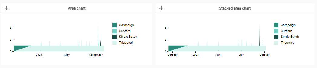
When to use:
- Compare evolution of 1 measure, potentially spread over multiple categories (values of 1 hierarchy)
- Visualize a trend or identify outliers
- Best practice: adjust the granularity depending on the amount of measure points. For example, when looking over a year, it could be better to take weeks or months rather than days.
100% Stacked Area Chart
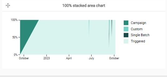
When to use:
- Compare percentage of sizes if you have multiple data sets and want to emphasize part-to-whole relationships.
Stream Area Chart
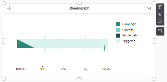
When to use:
- Centralized stacks make it easier to identify the larger areas over the stacks.
- Compare percentage of sizes if you have multiple data sets and want to emphasize part-to-whole relationships.
